ShopDreamUp AI ArtDreamUp

Deviation Actions


Description
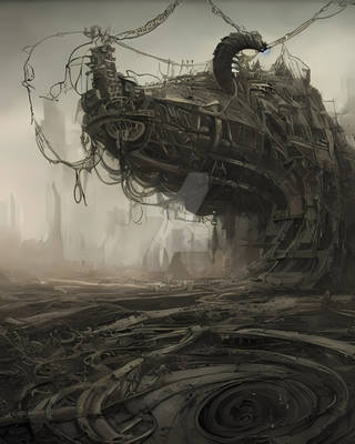
FULL VIEW NEEDED  (Smile)")
04/12/11: sharpness and color edit
4th tablet work, I'm still learning how to use this thing xP
I was just sketching randomly and I had this idea, it was just one building at first, but then things started getting bigger and bigger and there's the (partial) result. It's not a WIP, but I'll have to tweak some stuff, just need some patience haha. There was no REAL inspiration, it was kinda improvised, tho the "recon-alien-hunter-stealth-thing" was kinda inspired by WOTW Tripods.
The concept is that the humans that survived an alien invasion are being chased by these "recons" to be "rebuilt" by the invaders so they can be part of an alien-driven evil, dark, dystopian society of doom and all that stuff. *cliché*
That's the shittiest story you ever heard, but I needed a concept so whatever haha
hope you guys like it
Image size
1153x692px 1.1 MB
Comments124
Join the community to add your comment. Already a deviant? Log In
Beautiful, beautiful environment you've created, and great nods to the greats (definitely saw the War of the Worlds references).
I think the strongest things you have going for you are your subtle use of color and value and primarily your leading lines. Those cables are divine elements, They create those focusing diagonals, the first two being cables, the second being the bridge (nice tilt, very end-of-the-world), and the last implied by the first three and leading straight to the two figures. Excellent use of contrast, the figures are most apparent (miraculous, given their size, it's wonderful what selective value can do), with the tripods being secondary. The reddened sky is beautiful, especially with the contrast to those hidden greens in the buildings (nice touch making the structures more organic than the environment itself). The lighting on the building on the left though is rather off putting, it is a relatively high contrast area that really leads the viewer off the page. It creates excellent depth of field, and a good dynamic composition, but I don't really think you wanted such strong brights there, leave those for the focal point. Instead try to leave the rays as they are but darken up what they are illuminating, add some of that nice grunge to it, and maybe some more of those greens. Having everything but the light be in some hue or another is really great, when I critique the uncomfortable use of white in other paintings, I describe it as alienating the subject, in this case that's exactly what you wanted to do (I do love it when artists can successfully break conventions).
I think the one primary thing I would change with this is the relationship between the viewer and the two figures. I want to relate to them, but they are so distant, and the ground level is right on the base of the image. Bring the border down just a little bit, show some of the street, and we'll have a nice reflected light path (of that beautiful sky, balancing out that strong light shape it creates) leading straight to the subjects. That and maybe thicken the line of the nearest cable where it intersects the border a little more, to really get the eye started on that path.
All in all, excellent work, I love the ambiance you've created.